29 Website Usability Survey Questions
Website usability survey questions with 25 sample questions to improve UX, measure user experience, and refine your site design for better results.
When people leave your site without buying, clicking, or signing up, they are usually telling you something, just not with words. Website usability survey questions help you ask directly where people feel stuck, confused, or ready to bail faster than a bad first date.
In this article, you’ll learn the main types of usability survey questions, when to use each one, example questions you can borrow, and how to turn responses into smarter fixes that lift conversions with an online survey tool.
What Are Website Survey Questions About Usability?
Sample questions
How easy was it to find what you came here to do today?
At any point, did you feel confused about what to click next?
Did this page give you the information you expected?
How confident did you feel entering your information on this site?
Were you able to complete your task without any trouble?
Usability surveys spotlight friction before it becomes a conversion leak.
Website usability survey questions help you measure how easy your site feels to use in real life, not just how it looks in a design review.
They reveal whether people can navigate smoothly, understand your content, trust what they see, and finish key tasks like buying, booking, signing up, or contacting you.
Here’s the thing: this is not the same as a broad customer satisfaction survey.
A satisfaction survey asks how happy people feel overall, while a usability survey zooms in on the experience of using the site itself.
It is also different from market research, which explores audience preferences, buying habits, or brand perception, not whether your checkout button is playing hide-and-seek.
Why & When to Use
Use website usability surveys when you want direct feedback on what is helping or blocking action.
They are especially useful after key moments like product page visits, form completions, checkout exits, or support page sessions.
Strong survey design can help your team:
spot confusing navigation or weak content
improve UX and reduce friction
strengthen engagement signals that support SEO
increase conversions and repeat visits
build trust and retention over time
Plus, when you ask better questions, you get answers you can actually use.
Research shows the one-item Single Ease Question can predict task completion rates and times, making it effective for website usability surveys (MeasuringU).
Creating a website usability survey in HeySurvey is quick and easy. If you already see a template below, you can start from there and adjust it to fit your needs.
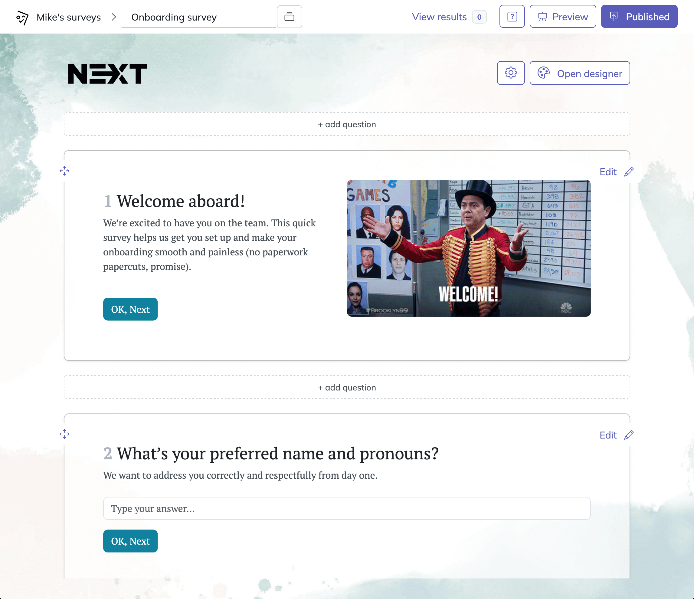
1. Create a new survey
Open HeySurvey and choose a blank survey or a template. If you want a fast start, pick a survey template and open it in the editor. You can begin without an account, but you will need one to publish and see responses.
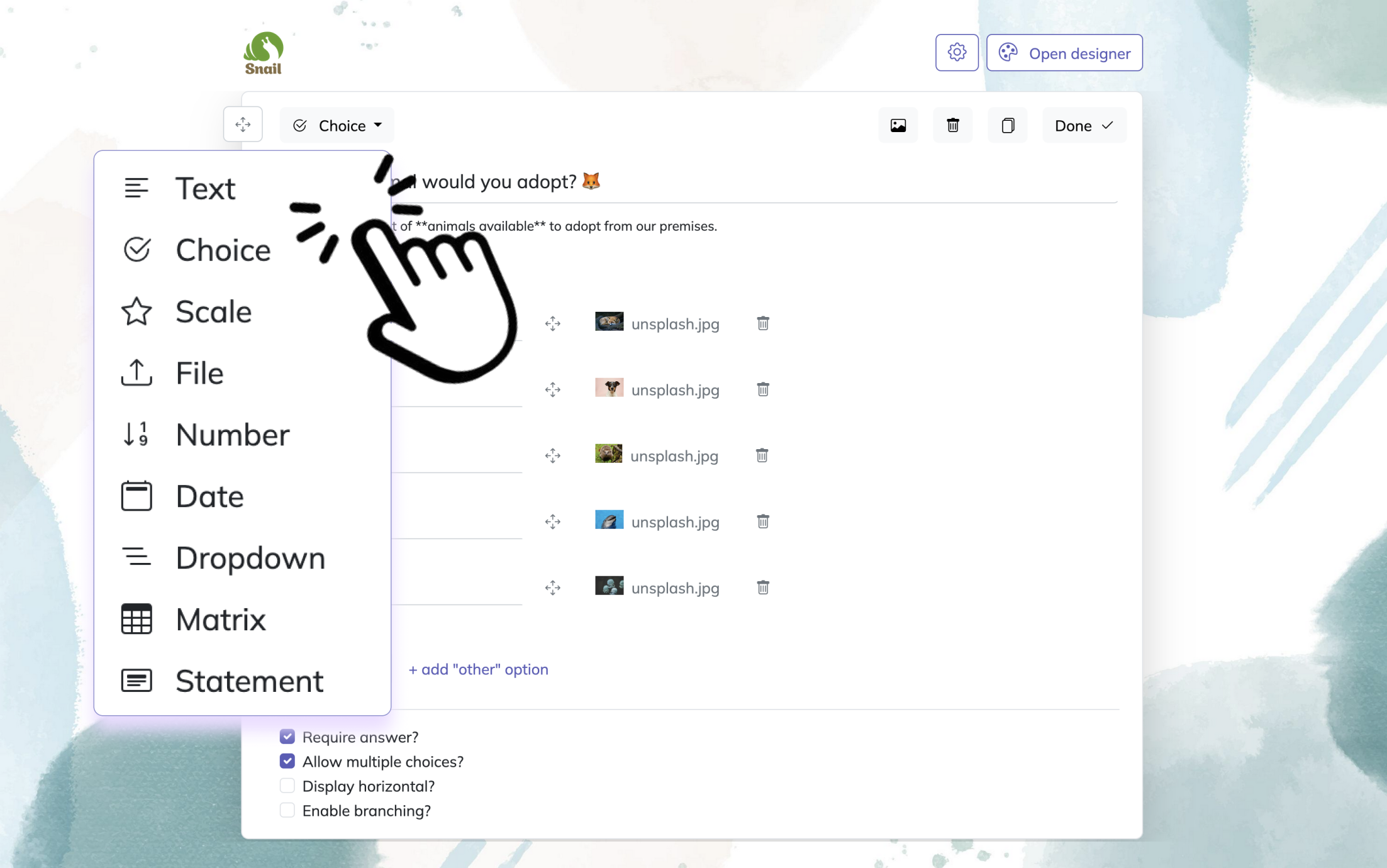
2. Add questions
Click Add Question to include the questions you need. For website usability surveys, use a mix of choice, scale, and text questions. Ask about navigation, page speed, design clarity, and whether users found what they were looking for. Mark important questions as required if needed.
3. Publish survey
When your survey is ready, click Preview to check it, then select Publish to make it live. HeySurvey will create a shareable link you can send to website visitors or place on your site.
Navigation and Information Architecture Survey Questions
Sample questions
How easy was it to find the information you were looking for on our website?
Did our menu and navigation labels make sense to you?
Was there any page, category, or section you expected to find but could not?
How confident did you feel that you were heading to the right page while browsing?
What part of the website structure felt confusing or unnecessary?
Clear navigation helps people move forward instead of wandering around like they lost the map.
Navigation and information architecture survey questions help you figure out whether people can find pages, categories, menus, and key content without getting stuck.
They show you if your labels make sense, your structure feels logical, and your pathways guide people to the right place instead of sending them on a little digital scavenger hunt.
Here’s the thing: the best navigation usually uses plain language, not clever internal jargon that only your team understands.
On top of that, open-ended follow-up questions can uncover missing categories, unclear menu labels, and weird dead ends you would never catch from dashboards alone.
Why & When to Use
Use this survey type when you want to know whether your site structure is helping people browse with confidence.
It is especially useful after a site redesign, navigation update, category expansion, or when analytics show high exit rates on important entry pages.
This works well for many site types, including:
ecommerce sites with large product catalogs
SaaS websites with multiple features or solutions pages
service businesses with layered offerings or location pages
content-heavy websites with lots of articles, resources, or help content
Plus, compare survey responses with site search terms and top exit pages to spot patterns faster and fix the pathways that are quietly leaking attention.
Baymard’s large-scale usability testing found 900+ navigation and taxonomy issues, showing unclear labels and structure significantly hinder findability on websites (source)
Content Clarity and Readability Survey Questions
Sample questions
How clear was the information on this page?
Did the content answer your main question or solve your problem?
Were any words, phrases, or explanations confusing?
Did you understand what action to take after reading the page?
What information was missing that would have helped you move forward?
Clear content helps you turn interest into action instead of making people reread the same sentence three times and question their life choices.
Content clarity and readability survey questions help you learn whether people actually understand your messaging, page purpose, offer, and next step.
They reveal when a page sounds polished but still leaves visitors wondering what you do, why it matters, or what they should click next.
Here's the thing: even strong ideas can fall flat when the reading level is too high, the formatting feels dense, or the page is hard to scan quickly.
On top of that, these surveys help you spot the gap between what users need to know and what your page currently says.
Why & When to Use
Use this survey type when bounce rates are high, engagement is low, or conversions are weaker than expected even though traffic looks healthy.
It works especially well for:
landing pages
product pages
service pages
blog posts
help centers and support resources
Plus, pair survey feedback with heatmaps, scroll depth, and engagement metrics when you can.
That combo helps you see not just what people found confusing, but where clarity drops off, which is very handy when your copy thought it was being crystal clear.
Design, Layout, and Visual Ease-of-Use Survey Questions
Sample questions
How easy was it to read and visually scan this page?
Did the page layout help you focus on the most important information?
Were any buttons, links, or page elements hard to notice?
Did anything about the design make the website feel confusing or overwhelming?
How visually comfortable was this website to use?
Good design should guide your visitor, not send them on a tiny scavenger hunt for the CTA.
Design, layout, and website survey questions about usability survey questions help you figure out whether your page looks helpful and feels easy to use, or quietly creates friction.
They show you when clutter, weak contrast, cramped spacing, or distracting elements make it harder for people to read, trust, and take action.
Here's the thing: a page can look beautiful in a review meeting and still be annoying on a phone.
Plus, these questions help you separate aesthetic opinions from real usability problems, which is important because "I do not like the vibe" and "I cannot find the button" are very different issues.
Why & When to Use
Use this survey type after layout changes, branding refreshes, mobile design updates, or anytime users seem hesitant to click, scroll, or continue.
It is especially useful when you want to evaluate:
clutter and content density
whitespace and breathing room
contrast and readability
visual hierarchy and focus
distracting pop-ups, banners, or animations
On top of that, watch for repeated complaints about button visibility, crowded sections, or mobile readability.
Those patterns usually point to real usability trouble, not just picky feedback, and that is the kind of insight you can actually fix.
Research shows webpage layout and design strongly influence how easily users find information, supporting survey questions about readability, hierarchy, and visual clutter. Source
Task Completion and Conversion Survey Questions
Sample questions
Were you able to complete the task you came here to do today?
How easy or difficult was it to complete your purchase, sign-up, or request?
At what step, if any, did you feel stuck or uncertain?
What nearly prevented you from completing this action?
What could we improve to make this process faster or easier?
Conversion friction loves to hide in the middle of the process, not just at the end.
Task completion and conversion survey questions help you understand whether people can actually finish the action you want them to take, like buying, booking, signing up, or submitting a form.
They are especially useful on checkout flows, lead forms, demo request pages, account setup flows, and other spots where a small snag can quietly cost you results.
Here's the thing: analytics can show you where people drop off, but they usually cannot tell you why.
Plus, this survey type helps you pinpoint friction by step, so you can see whether the problem shows up at payment, form length, account creation, confirmation, or somewhere sneakier.
Why & When to Use
Use these questions when abandonment is showing up in your data and you need the reason behind it, not just the sad little dip on a dashboard.
They work best when you want to evaluate:
how easily users complete a high-value action
where people feel stuck, hesitant, or confused
what practical barriers slow them down
what emotional barriers create doubt or second thoughts
On top of that, mix rating-scale questions with open-text responses.
That combo helps you uncover both measurable pain points and messy human reactions, which are often where the real gold is.
For sharper insights, segment responses by:
device type
traffic source
new vs. returning users
Because yes, your checkout may feel smooth on desktop and act like a raccoon in a trash can on mobile.
Trust, Credibility, and Reassurance Survey Questions
Sample questions
Did this website feel trustworthy to you? Why or why not?
Was there enough information to help you feel confident in taking the next step?
Did anything on this page make you hesitate or feel uncertain?
What additional proof or reassurance would have increased your confidence?
How clear were pricing, policies, guarantees, or contact details?
Trust problems often wear a usability costume.
A page can be easy to use and still fail if you do not feel safe, informed, or confident enough to move forward.
That is why trust, credibility, and reassurance survey questions matter so much on product pages, pricing pages, checkout pages, service pages, and any spot where people pause right before converting.
Here's the thing: hesitation is not always about confusing design.
Sometimes it comes from vague claims, missing proof, hidden costs, weak contact information, or a general "something feels off" vibe.
These questions help you uncover the quiet doubts that analytics alone cannot explain, which is handy because doubt rarely announces itself with jazz hands.
Why & When to Use
Use this survey type when conversion issues may actually be trust issues in disguise.
It is especially useful when you want to evaluate:
whether your page feels legitimate and credible
whether pricing, policies, and guarantees are clear enough
whether social proof and proof points actually reassure people
whether contact details and business information feel visible and real
Plus, compare this feedback with abandonment data on pricing and checkout pages.
On top of that, look for patterns around transparency, policy clarity, testimonials, reviews, guarantees, and other legitimacy signals that help people feel comfortable saying yes.
Mobile Website Usability Survey Questions
Sample questions
How easy was it to use this website on your phone?
Were buttons, menus, and links easy to tap accurately?
Did you have any trouble reading content or viewing page elements on mobile?
Was any part of the mobile experience slower or more frustrating than expected?
What is the biggest improvement we could make to this website on mobile?
Mobile friction hides in small moments.
Mobile users deal with a different reality than desktop users, and tiny annoyances can pile up fast.
A button that is slightly too small, a popup that hijacks the screen, or a form that feels like typing taxes on a toaster can be enough to make you leave.
These survey questions help you spot the pain points that show up on smaller screens, especially around thumb-friendly design, mobile readability, speed perception, and form friction.
Here's the thing: people may not say "your responsive layout has usability flaws."
They usually say it felt annoying, cluttered, slow, or just like too much work.
Why & When to Use
Use this survey type when mobile traffic is high, mobile conversions trail behind desktop, or you have recently changed your responsive design.
It is especially helpful for understanding whether your mobile experience supports real users instead of merely shrinking the desktop version and hoping for the best.
Pay close attention to feedback about:
hard-to-tap buttons or crowded menus
unreadable text or awkward page layouts
intrusive pop-ups or overlays
forms that feel tedious on a phone
Plus, connect survey responses with mobile bounce rate, scroll depth, and form abandonment.
On top of that, mobile usability can affect both user satisfaction and SEO performance, so improving it helps people and rankings at the same time.
Best Practices for Writing and Using Website Usability Surveys
Sample questions
How easy was it to complete your goal today?
What almost stopped you from continuing?
What information did you expect to find but did not?
What felt confusing, frustrating, or unnecessary?
What one change would most improve your experience?
Great survey data starts with great survey design.
Even the smartest survey categories can flop if your questions are vague, leading, badly timed, or long enough to feel like a mini audition.
Here’s the thing: this is the operational playbook for getting cleaner insights, better response quality, and fewer useless answers like “it was fine,” which helps absolutely nobody.
Why & When to Use
Use these best practices whenever you create, revise, launch, or review a website usability survey.
Plus, they matter most when response rates are low, answers are all over the place, or your team keeps collecting feedback without learning much from it.
A strong usability survey should:
stay short and connect to a specific page, action, or task
ask one thing at a time
use neutral wording instead of nudging users toward an answer
combine rating questions with open-ended follow-ups
appear at relevant moments, not like a popup raccoon jumping from the bushes
On top of that, segment responses by page type, device, and user intent so patterns are easier to trust.
Avoid common mistakes like these:
asking leading questions
stuffing in too many fields
collecting feedback with no plan to review it
dismissing recurring qualitative themes
treating all users like one giant identical blob
Also, watch frequency, timing, audience targeting, and how you analyze responses, because good questions only work if the whole setup does too.
How to Turn Website Usability Survey Insights Into Action
Sample questions
Which survey issues show up most often and affect the most important user goals?
What feedback themes keep repeating across pages, devices, or audience segments?
Which comments can be turned into clear tests or UX changes this week?
What does survey feedback confirm when you compare it with analytics and conversion data?
Which improvements are most likely to help both users and business results?
Insight only matters when you actually use it.
A website usability survey is not a suggestion box you politely ignore after launch.
Here’s the thing: you do not need to react to every one-off complaint, because one dramatic comment is not automatically a five-alarm UX fire.
Why & When to Use
Use this approach when survey responses start piling up and your team needs to decide what to fix first.
Plus, it is especially useful when feedback feels messy, contradictory, or emotionally persuasive but not yet proven.
Start by prioritizing findings based on impact and frequency.
Fix issues that appear often
Focus on problems tied to key actions like navigation, form completion, signups, or purchases
Treat isolated comments as clues, not marching orders
Next, group responses into themes so patterns are easier to spot.
navigation
content clarity
trust signals
mobile usability
conversion friction
On top of that, turn feedback into testable improvements for menus, page layouts, forms, calls to action, and messaging.
Pair survey insights with analytics, on-site search behavior, and conversion data to validate what users say against what they do.
Best takeaway: the strongest website usability survey questions lead you to specific fixes, better engagement, and results your team can actually measure.
Related UX Survey Surveys
27 Survey Questions About Website
Explore 25 sample survey questions about website design, usability, and feedback to improve engag...
29 Software User Experience Survey Questions
Explore 25 software user experience survey questions with sample insights to improve product feed...
29 UX Survey Questions Example
Explore 25 UX survey questions example prompts to improve user feedback, measure satisfaction, an...