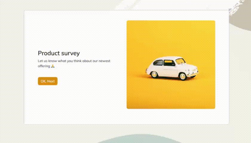
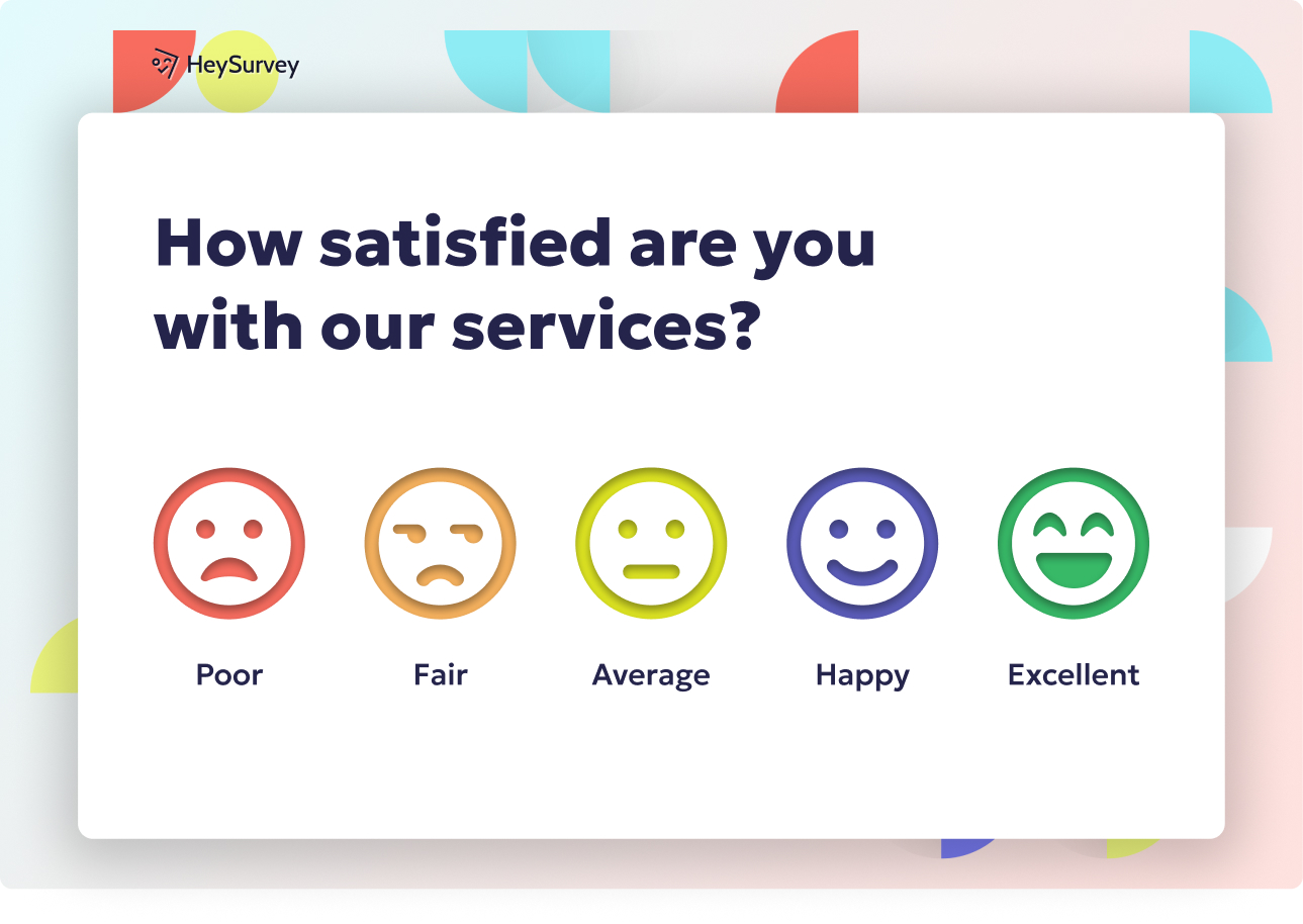
31 Website Survey Questions About Usability
Explore 25 website survey questions about usability to improve user experience, uncover insights, and optimize site design with clear feedback.
A website usability survey helps you see your site the way your visitors do, which is often equal parts helpful and humbling. The right questions reveal where people get stuck, confused, or quietly give up before converting.
If you want better web usability testing questions or stronger website survey questions about usability, you need more than guesses. Plus, this guide will walk you through survey types, example questions, best practices, and how to turn feedback into fixes that actually move the needle.
Sample questions
What do you think this website is about at first glance?
How easy was it to understand what the website offers?
Did anything on the homepage feel confusing or unclear?
What information were you expecting to find immediately?
How likely would you be to continue exploring this website based on the homepage alone?
Homepage and First-Impression Usability Survey Questions
Your homepage gets judged fast, like painfully fast.
Why & When to Use
Homepage feedback is one of the most useful sources of web usability testing questions because it shows you what people understand before they click, scroll, or vanish into the internet void.
Use this survey type when you want to know whether first-time visitors instantly "get" what your site offers. It works especially well for homepage reviews, redesign validation, new visitor testing, and early messaging checks.
Here's the thing: first impressions shape bounce rate, engagement, and trust. If your homepage feels vague, cluttered, or confusing, people often leave before your real value even gets a chance to shine.
These website survey questions about usability are most effective with people who do not already know your brand. On top of that, they are great for moderated tests, unmoderated studies, or quick post-visit surveys.
Look for patterns in the words people use in open-ended answers.
If several people say "not sure what this site does," your value proposition likely needs work.
If they mention the wrong audience or offer, your messaging may be pointing in the wrong direction.
If they say they would not keep exploring, your homepage may be creating friction instead of curiosity.
Plus, repeated wording gives you clues you can actually act on, which is much nicer than guessing and hoping for a miracle.
Sample questions
How easy was it to find the information you were looking for?
Were the menu labels clear and understandable?
Did you ever feel lost while navigating the website?
Which part of the navigation, if any, was confusing?
What information was harder to find than expected?
Research shows users form reliable homepage first impressions in as little as 50 milliseconds, making early user experience survey questions especially valuable for testing clarity and appeal (source).
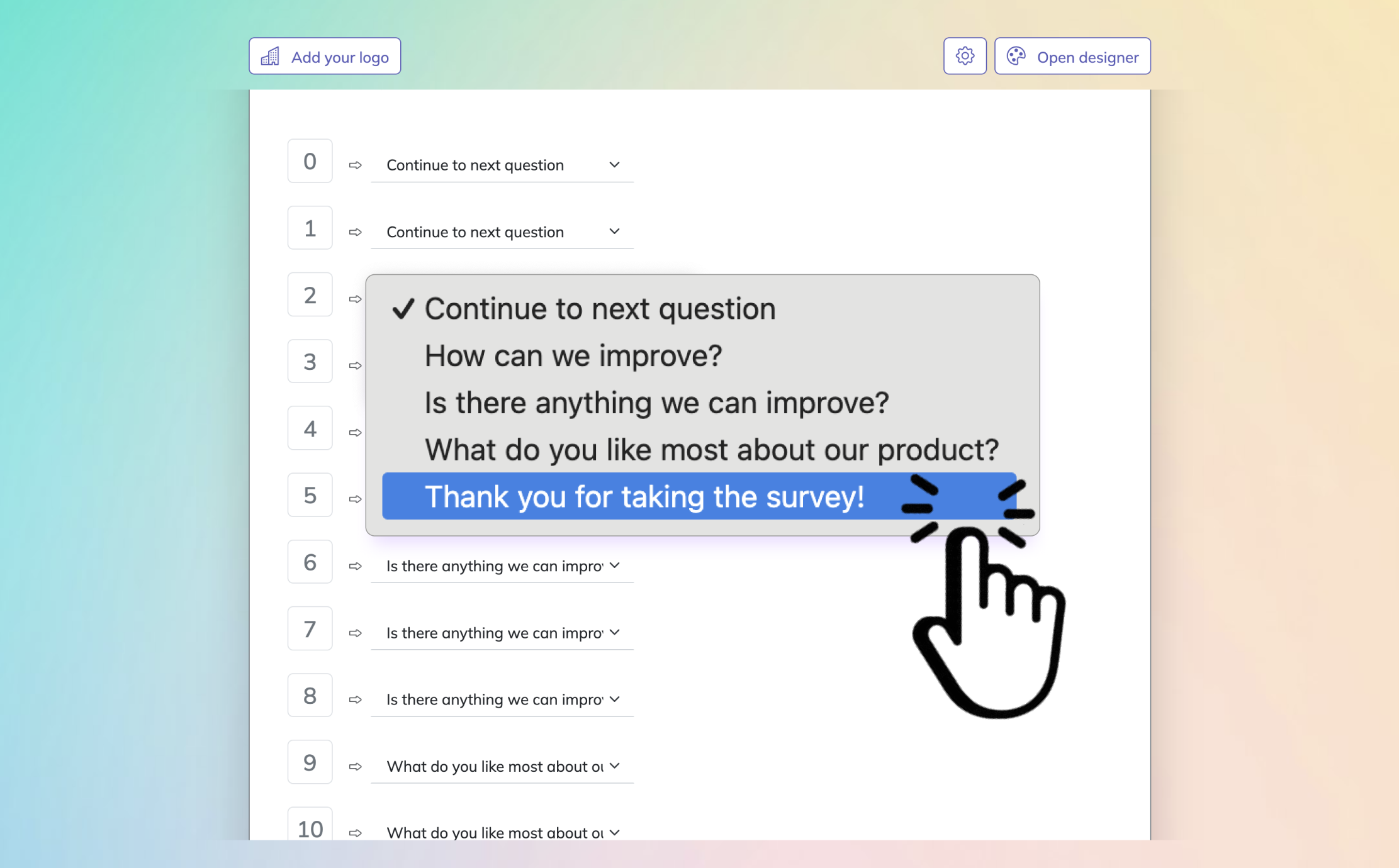
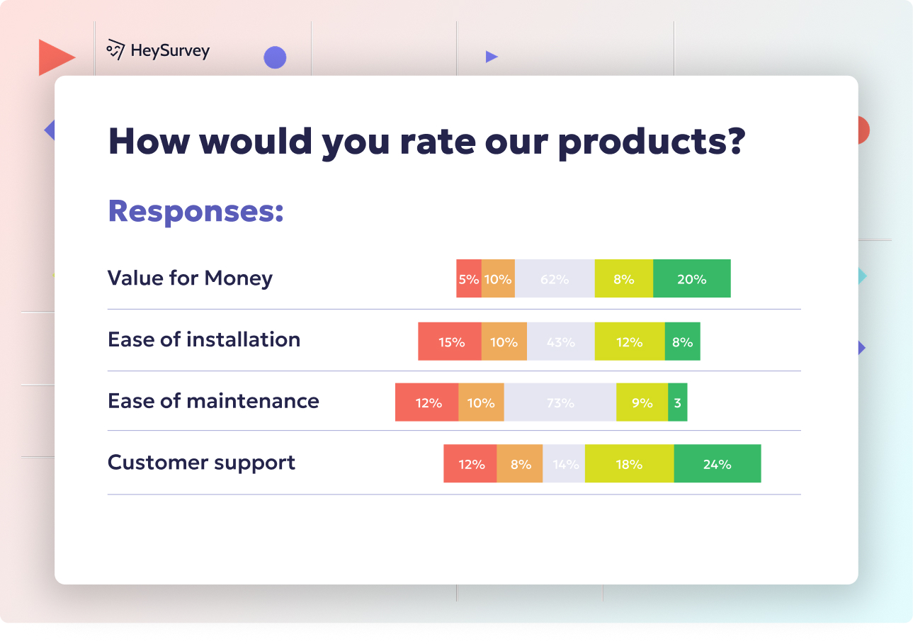
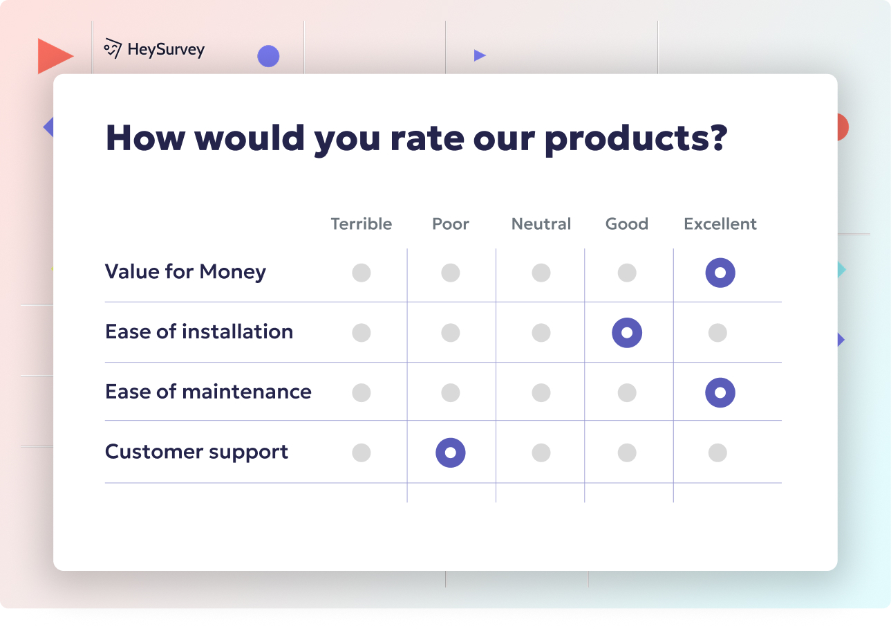
How to create a website usability survey in HeySurvey
1. Create a new survey
Start by opening a template with the button below, or choose a blank survey if you want to build everything from scratch. Give your survey a clear name so you can find it later. If you already have an account, log in to save and publish your work. If not, you can still begin editing right away with our online survey tool.
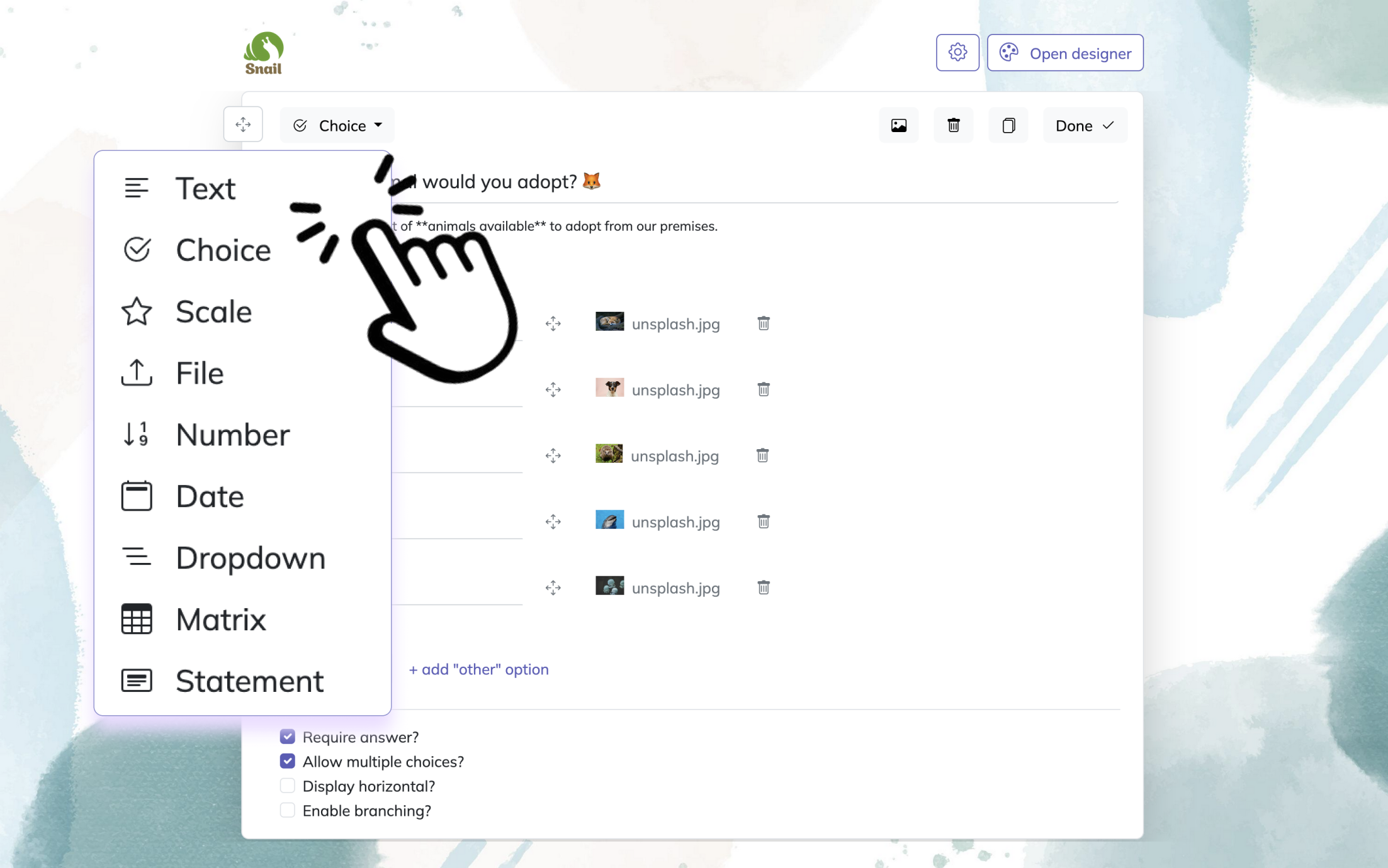
2. Add questions
Click Add Question to include the questions you want website visitors to answer. For usability surveys, use a mix of choice, scale, and text questions. For example, ask how easy the site was to use, whether navigation was clear, and what could be improved. Mark important questions as required if needed. You can also add short descriptions to make each question easier to understand.
3. Publish the survey
Review your survey with the Preview button to see how it looks on desktop and mobile. When everything is ready, click Publish to get a shareable link or embed it on your website.
Website Navigation and Findability Survey Questions
Good navigation helps you get people where they need to go before their patience packs a suitcase.
Why & When to Use
These web usability testing questions help you figure out whether people can find pages, products, services, or key details without getting annoyed halfway through.
Use them when visitors abandon key journeys, lean too hard on site search, or click around like they are trapped in a digital corn maze.
These website survey questions about usability are especially useful for sites with big catalogs, layered menus, complex information architecture, or different audience groups with different goals.
Here's the thing: navigation problems are not always content problems. Your content might be perfectly fine, but if people cannot locate it, the experience still feels broken.
Poor findability often shows up in ways you can spot fast.
More support requests asking where basic information lives
Repeated backtracking between pages
Heavy use of search for simple tasks
Drop-off during product discovery or service comparison
Plus, these answers become much more useful when you group them by page type or user intent.
Compare product seekers vs. support seekers
Review answers by menu section or template type
Look for patterns around labels, categories, and dead ends
On top of that, this helps you see whether the issue is unclear naming, weak hierarchy, or just too many choices piled into one menu.
Sample questions
How clear was the information on this page?
Did the content answer your main questions?
Were any words, phrases, or terms confusing?
How easy was the page content to scan quickly?
What additional information would have helped you move forward?
Baymard’s 2-year usability study found users repeatedly abandoned sites when navigation and taxonomy prevented them from finding products efficiently (source).
Content Clarity and Readability Survey Questions
Clear content does heavy lifting, even when your design is doing its best runway walk.
Why & When to Use
These web usability testing questions help you learn whether your copy is easy to understand, relevant, and actually useful when someone lands on the page.
They work especially well for service pages, product pages, landing pages, FAQs, and onboarding content where people need quick answers before they take the next step.
Here’s the thing: usability is not just about layout, buttons, and navigation. Content clarity is a major usability factor, because even a beautiful page can flop if your message reads like it was written for a robot accountant.
Use these website survey questions about usability when people visit but do not convert, especially if they seem unsure about benefits, steps, pricing logic, requirements, or unfamiliar terms.
A few common content issues tend to show up again and again.
Jargon that makes sense internally but not to first-time visitors
Long, overloaded paragraphs that are hard to scan
Missing details people need to compare options or make decisions
Copy that explains features but not why they matter
Plus, compare feedback from new users and existing customers.
New users can reveal knowledge gaps and confusing terminology
Existing customers can show where your content assumes too much background knowledge
On top of that, this survey type helps you spot whether the problem is unclear writing, weak structure, or missing context that keeps people from moving forward.
Sample questions
How visually easy was this website to use?
Did the page layout help you focus on the most important information?
Was anything on the page distracting, overwhelming, or cluttered?
How easy was it to read text and distinguish buttons or links?
Did the design make you feel confident using the website?
Design, Layout, and Visual Ease-of-Use Survey Questions
Good visual design quietly helps you win trust before a single word gets read.
Why & When to Use
Use these web usability testing questions to measure whether your site feels visually intuitive, organized, and comfortable to use.
They are especially useful during redesigns, mobile optimization reviews, or anytime users say a page feels cluttered, busy, or weirdly hard to use.
Here’s the thing: a website can be technically functional and still feel confusing if the visual layout fights for attention like five toddlers with kazoos.
These website redesign survey questions help you evaluate visual hierarchy, readability, contrast, spacing, and distraction levels so you can see whether users know where to look first.
They also help uncover an important perception gap.
If a page looks messy, users often assume it is harder to use
If text is hard to scan, people may miss key actions or information
If buttons, links, or forms do not stand out, confidence drops fast
Plus, review answers alongside device type.
A layout that feels clean on desktop may feel cramped on mobile
Font size, spacing, and tap targets often create different usability issues across screen sizes
On top of that, “professional looking” and “easy to use” often overlap in users’ minds, so visual polish is not just cosmetic. It is part of usability.
Sample questions
How easy was it to complete your task on this website?
At what point, if any, did you feel stuck?
Was there any step that took longer than expected?
What nearly stopped you from finishing this action?
How confident did you feel while completing the process?
Research synthesized by IxDF shows visual aesthetics often correlate strongly with perceived usability, sometimes more than objective performance does (source).
Task Completion and Conversion Usability Survey Questions
These are the web usability testing questions that connect usability directly to results.
Why & When to Use
Use this survey type when you want to know whether people can actually finish high-value actions like signing up, booking, buying, requesting a quote, or submitting a form.
It works especially well for checkout flows, lead generation forms, account creation, and any core conversion path where a smooth experience really matters.
Here’s the thing: analytics can show you where users drop off, but they usually do not tell you why they bailed, hesitated, or rage-clicked their way into the void.
That is why these website survey questions about usability are so valuable.
They tie feedback directly to business outcomes, so you are not just learning that something feels awkward, you are learning that awkwardness may be costing conversions.
To get the best answers, align your web usability testing questions with one specific user goal at a time.
Completing a purchase
Creating an account
Submitting a lead form
Booking a demo or appointment
Plus, pair survey responses with funnel analytics.
Analytics show where friction happens
Survey answers help explain what caused it
Together, they make usability issues much easier to fix
On top of that, specific questions lead to specific improvements, which is a lot more useful than a vague “it was fine.”
Sample questions
How trustworthy did this website feel to you?
Did anything make you hesitate before taking action?
Did the website provide enough information to feel credible?
How confident would you feel sharing your information on this site?
What would make this website feel more trustworthy?
Trust, Credibility, and Confidence Survey Questions
Trust shapes whether people move forward or quietly back away.
Why & When to Use
Use these web usability testing questions when you need to understand whether people feel safe enough to engage, convert, or share personal information.
They are especially useful for financial, healthcare, B2B, and ecommerce sites, or any experience that asks for payment details, contact info, or sensitive data.
Here’s the thing: trust is not just a branding issue.
It is a usability issue too, because uncertainty interrupts action fast.
If users are unsure whether your site is legitimate, secure, or professional, they may stop before clicking, submitting, or buying.
That makes these website survey questions about usability especially helpful when traffic looks healthy but conversions stay oddly low.
Common trust signals often show up in responses, so keep an eye out for patterns like:
Visible contact information
Customer reviews or testimonials
Clear return, refund, or privacy policies
Security cues during payment or form submission
Consistent branding, design, and messaging
Plus, do not lump everyone together.
Analyze answers separately for new and returning visitors, because first-timers often need more reassurance, while repeat visitors may be quicker to spot anything that feels off.
A tiny trust wobble can act like a giant “maybe later” button.
Sample questions
What was your goal when you came to this website today?
Were you able to complete your goal successfully?
What was the hardest part of using the website?
What, if anything, would you change first?
How would you describe this experience to someone else?
Web Usability Testing Questions vs. Website Survey Questions About Usability
Behavior shows what happened, while feedback tells you how it felt.
Why & When to Use
Use this section when you are choosing between web usability testing questions and website survey questions about usability, and you want the right tool for the job instead of the research version of throwing spaghetti at the wall.
Here’s the thing: they are not the same, even though they often work best together.
Web usability testing questions are usually task-based.
You ask people to try something specific, watch what they do, and notice where they hesitate, get lost, or click the digital equivalent of the wrong door.
Website survey questions about usability are different because they capture self-reported feedback after or during the experience.
That means surveys tell you what users think, feel, remember, and describe in their own words.
Testing reveals behavior.
Surveys reveal perception.
Plus, both matter, because users do not always explain what they actually did, and they also do not always do what they say they would do.
Use each method like this:
Choose usability testing when you need to observe task success, friction points, and real behavior.
Use surveys when you want quick feedback at scale about satisfaction, clarity, and perceived ease of use.
Combine both when you want the strongest picture of what users did and why they felt that way.
On top of that, surveys are one piece of a broader usability research process, not the whole pizza.
Sample questions
Was this survey quick and easy to answer?
Did any question feel unclear or repetitive?
Were you comfortable answering these questions honestly?
Did the survey ask about the right part of your experience?
Is there anything else you would like to tell us about using the website?
Best Practices for Writing and Using Website Usability Survey Questions
Good survey design turns vague opinions into useful next steps.
Why & When to Use
Use this section before launching any set of website survey questions about usability, especially if you want answers you can actually use instead of a messy pile of maybes.
It works well for marketers, UX teams, SEO specialists, and site owners who want sharper web usability testing questions, cleaner feedback, and fewer guess-what-the-user-meant moments.
Here’s the thing: even strong surveys can fail if they are too long, too vague, or badly timed.
Keep most website survey questions about usability to about 5 to 10 questions, show them right after a key task or page visit, and review responses alongside analytics or web usability testing questions for the full picture.
Do:
Keep questions short, specific, and focused on one idea.
Match each survey to a single page, task, or moment.
Mix rating questions with open-ended responses.
Trigger the survey at the right point in the user journey.
Segment results by device, traffic source, or visitor type.
Don’t:
Ask too many questions in one go.
Use leading or biased wording.
Cram two questions into one sentence.
Collect feedback without a review plan.
Treat survey data as the whole story because your analytics would like a word.
Sample questions
Which issue had the biggest impact on your experience?
What one improvement would most help you complete your goal faster?
Which page or step needs the most improvement?
What nearly caused you to leave the website?
If we fixed one thing first, what should it be?
How to Turn Website Usability Survey Insights Into Action
Feedback only matters if you actually use it to improve the site.
Why & When to Use
Use this final step after your website survey questions about usability start bringing in real responses and your team needs to decide what to fix first.
It is especially useful when web usability testing questions reveal patterns, but you still need a practical plan for improving content, navigation, design, and conversions without playing digital whack-a-mole.
Here’s the thing: not every problem deserves equal attention.
Start by grouping feedback into simple themes so repeated issues are easier to spot.
Navigation problems
Content clarity issues
Trust concerns
Task friction or checkout blockers
Plus, prioritize fixes based on three things: how often the issue appears, how badly it hurts the experience, and how much it affects business goals.
That means one annoying typo may wait, while one confusing form field that scares off leads should go straight to the front of the line.
On top of that, do not stop at guessing.
Use follow-up website survey questions about usability, quick usability tests, or A/B tests to confirm your changes actually helped.
A smart workflow for web usability testing questions looks like this:
Collect feedback
Find patterns
Rank issues
Fix the highest-impact problems
Validate the result
Repeat regularly
Because the best usability strategy is never one and done, it is more like watering a plant, except hopefully with fewer dead leaves.
Related UX Survey Surveys
27 Survey Questions About Website
Explore 25 sample survey questions about website design, usability, and feedback to improve engag...
29 Software User Experience Survey Questions
Explore 25 software user experience survey questions with sample insights to improve product feed...
29 UX Survey Questions Example
Explore 25 UX survey questions example prompts to improve user feedback, measure satisfaction, an...